FROM OUR HOME, TO YOURS
Client
Waza Nikkei
Services
Creative Direction · Brand Identity · Menu Design
Food Photography · Website Design · Social Media Launch
Industry
Restaurant & Catering
Tools
Shopify · Illustrator · Photoshop · Lightroom
Waza Nikkei is a newly launched restaurant offering Japanese–Peruvian cuisine for delivery, pickup, catering, and private events. With no prior brand assets, my role was to develop a complete visual identity that felt modern, fresh, and approachable, while honoring the dual traditions of Nikkei cuisine.
Client Brief
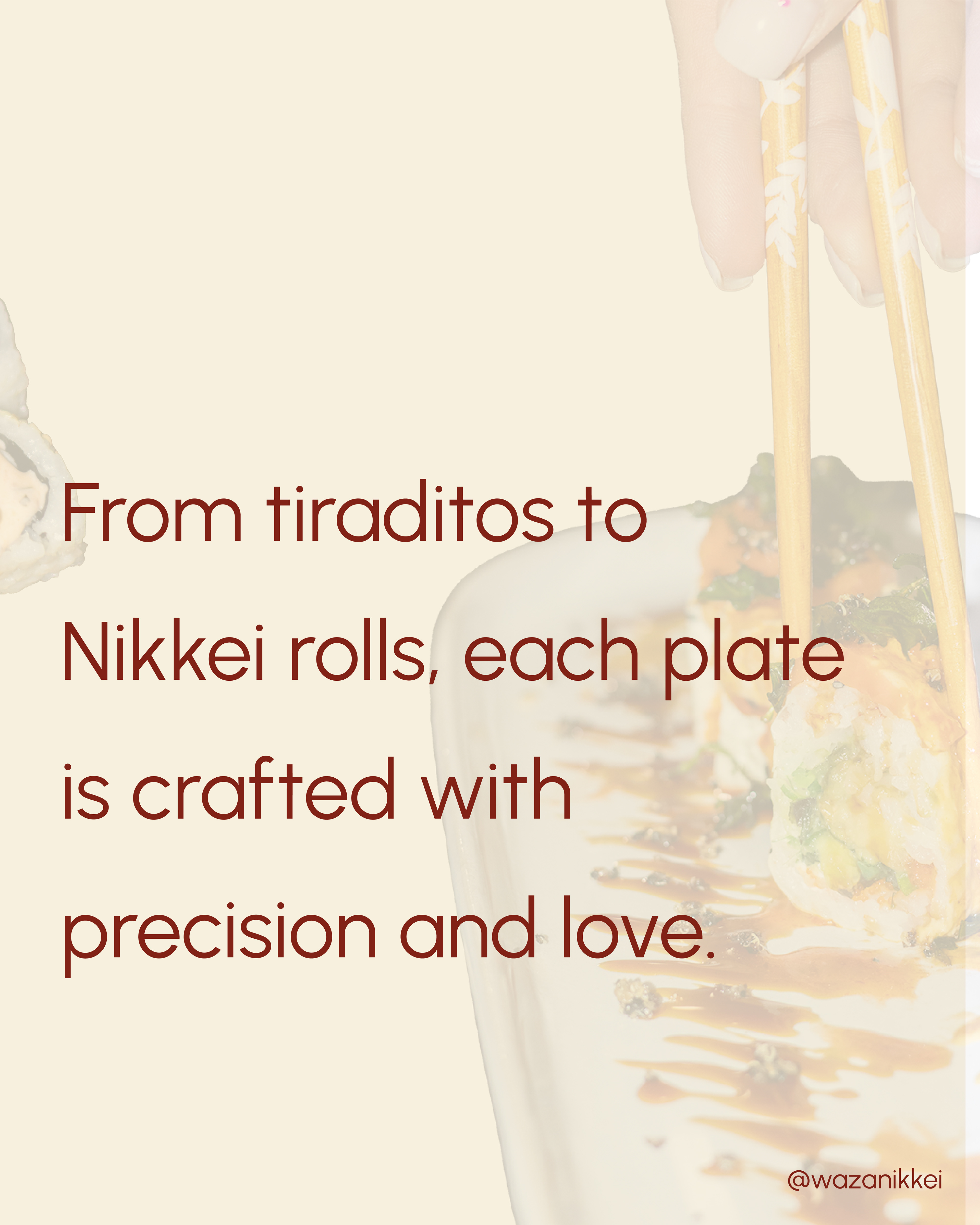
• “We want our food to feel like it comes from home, so clients feel at home when they eat it, surrounded by warmth and trust.”
• “Our cuisine combines the warmth of Peruvian flavors with the precision of Japanese technique.”
• “Our ideal clients are young audiences who enjoy fresh, bold flavors but also appreciate tradition.”
• “We want to transmit joy, energy, and love in every detail of the brand.”
Design Direction
Warm color palette, bold typography and energetic photography style.
Every creative decision was rooted in making the brand feel both modern and inviting, like sharing a meal at home.
Brand Concept & Moodboards
To establish the brand’s personality, I created two distinct moodboards for the client:
Moodboard 1 → geometric, modern, minimal, playful, youthful, with warm vibrant colors.
Moodboard 2 → elegant, traditional, serif-based typography with cooler tones.
The client chose Moodboard 1, leading to a bold, dynamic, and welcoming identity.·
Moodboard 1
Moodboard 2
Typography
• Bebas Neue (bold, geometric headlines)
• Urbanist (clean, modern body text & menu)
Color Palette
• Warm Cream → freshness, calm, and a welcoming base
• Crimson Red → passion, energy, and bold strength
• Golden Sand → joy, warmth, and a touch of elegance
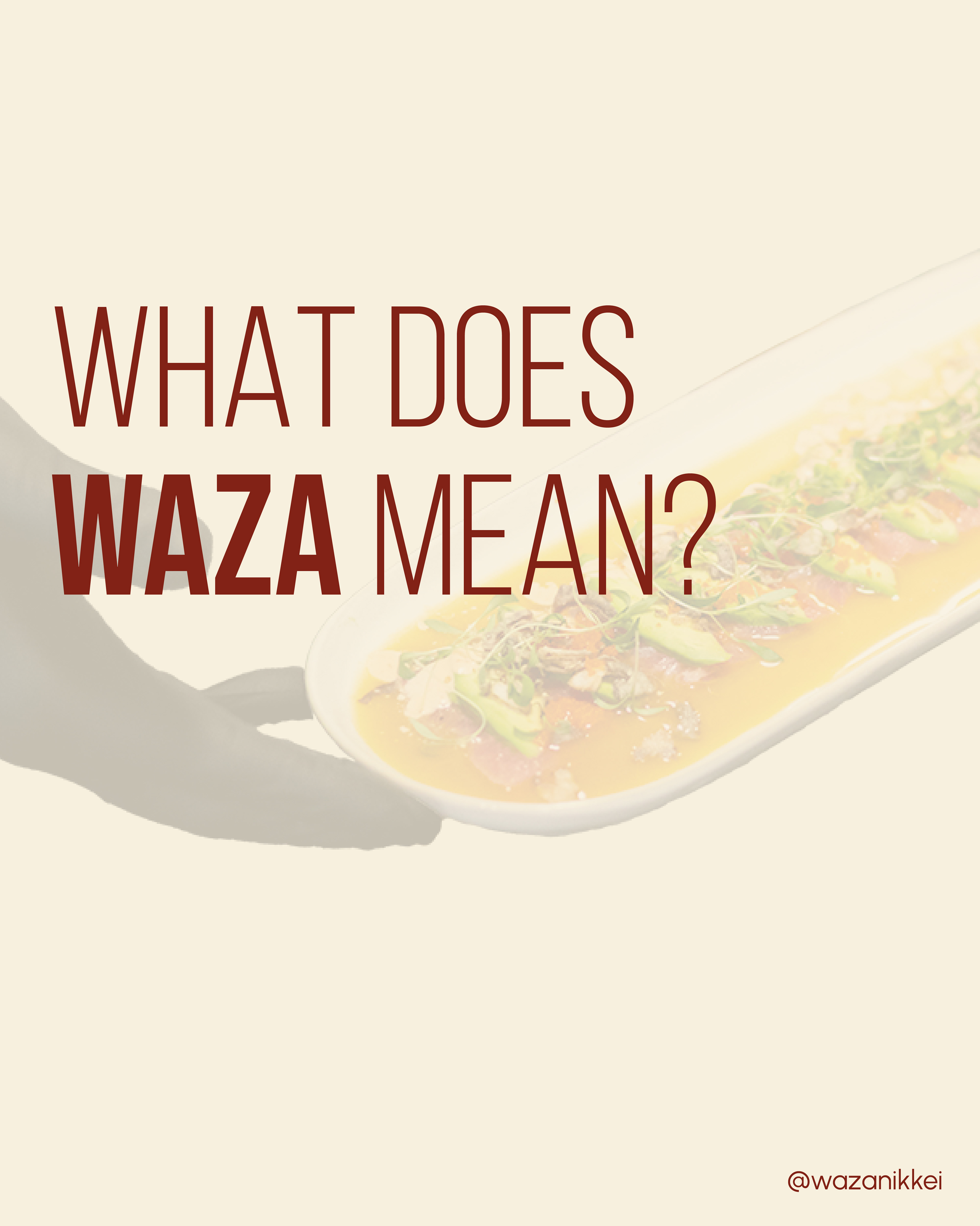
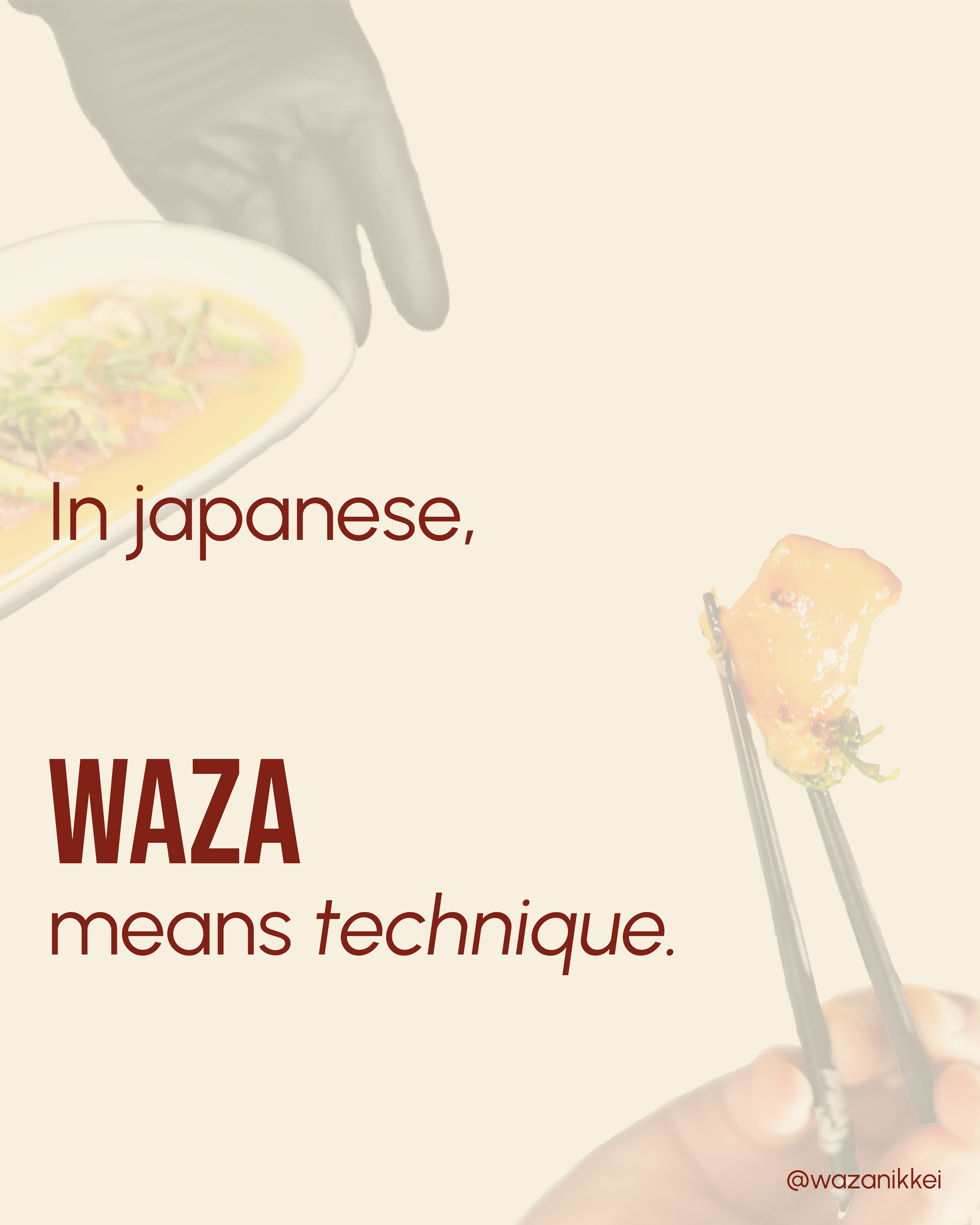
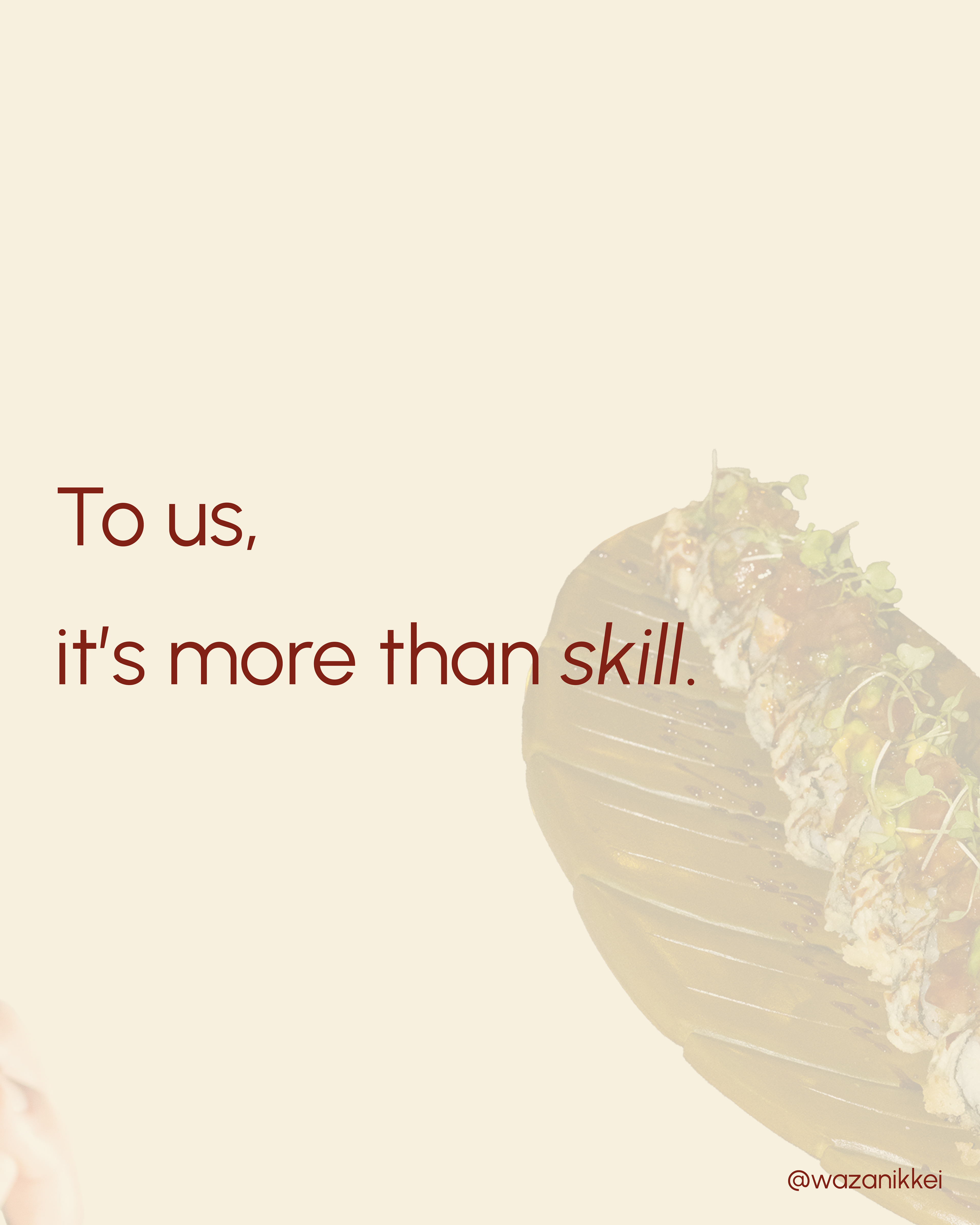
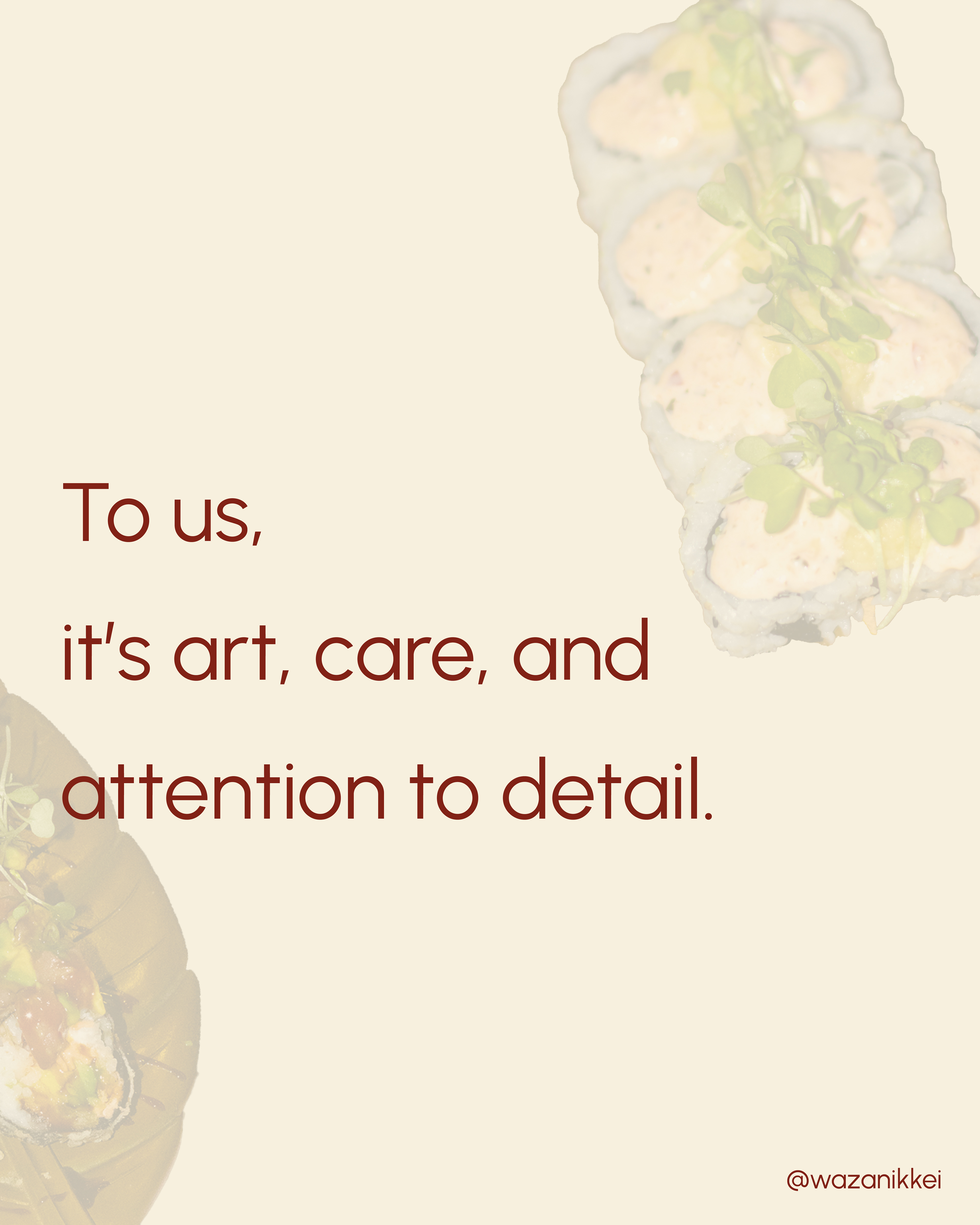
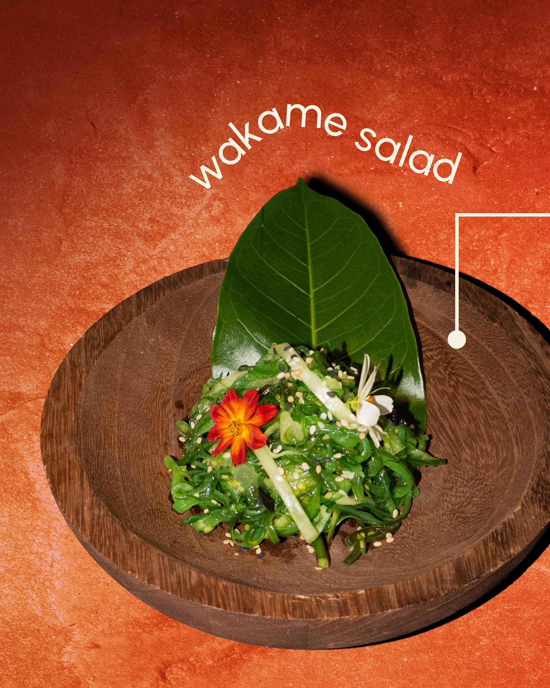
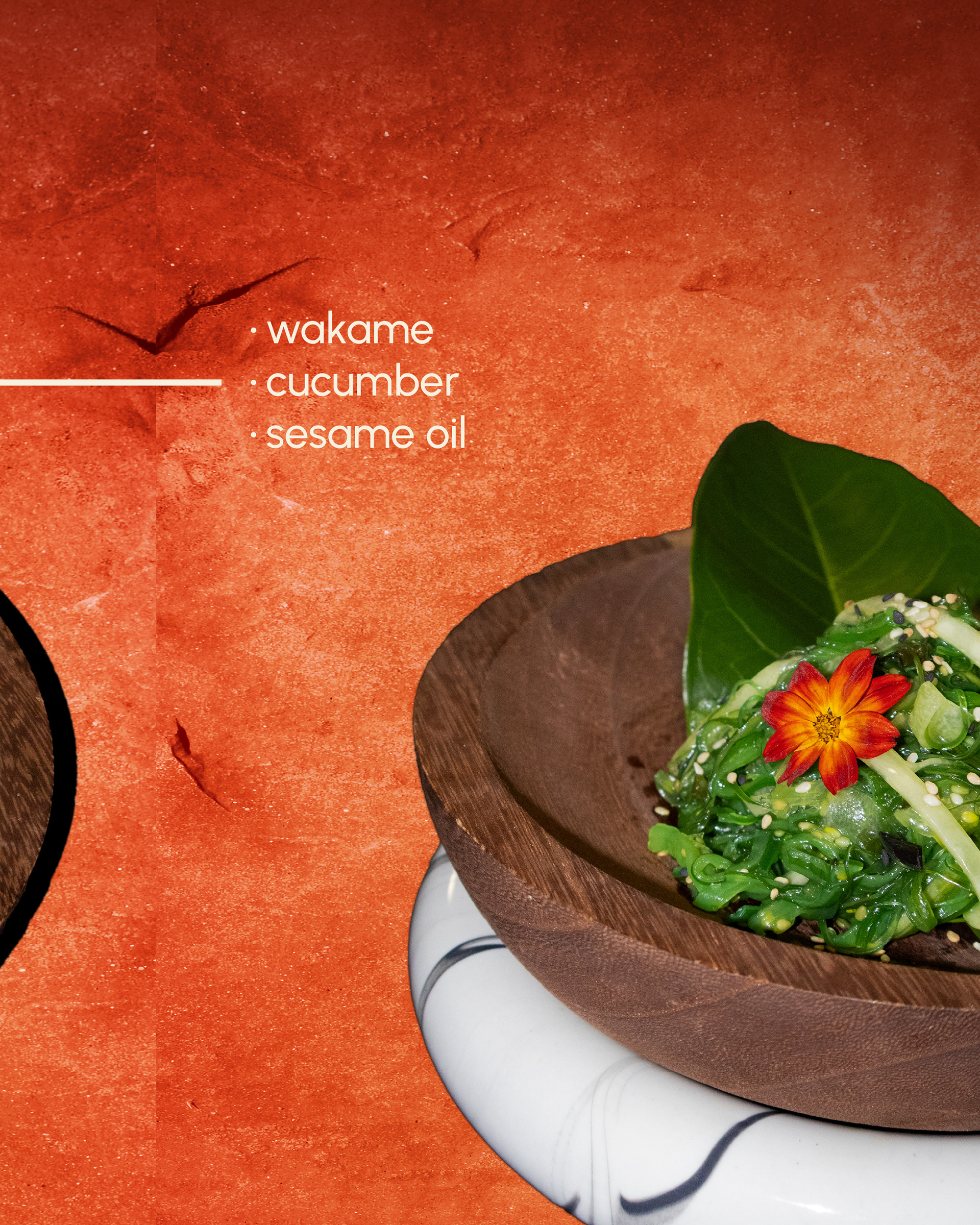
Instagram posts
Photography
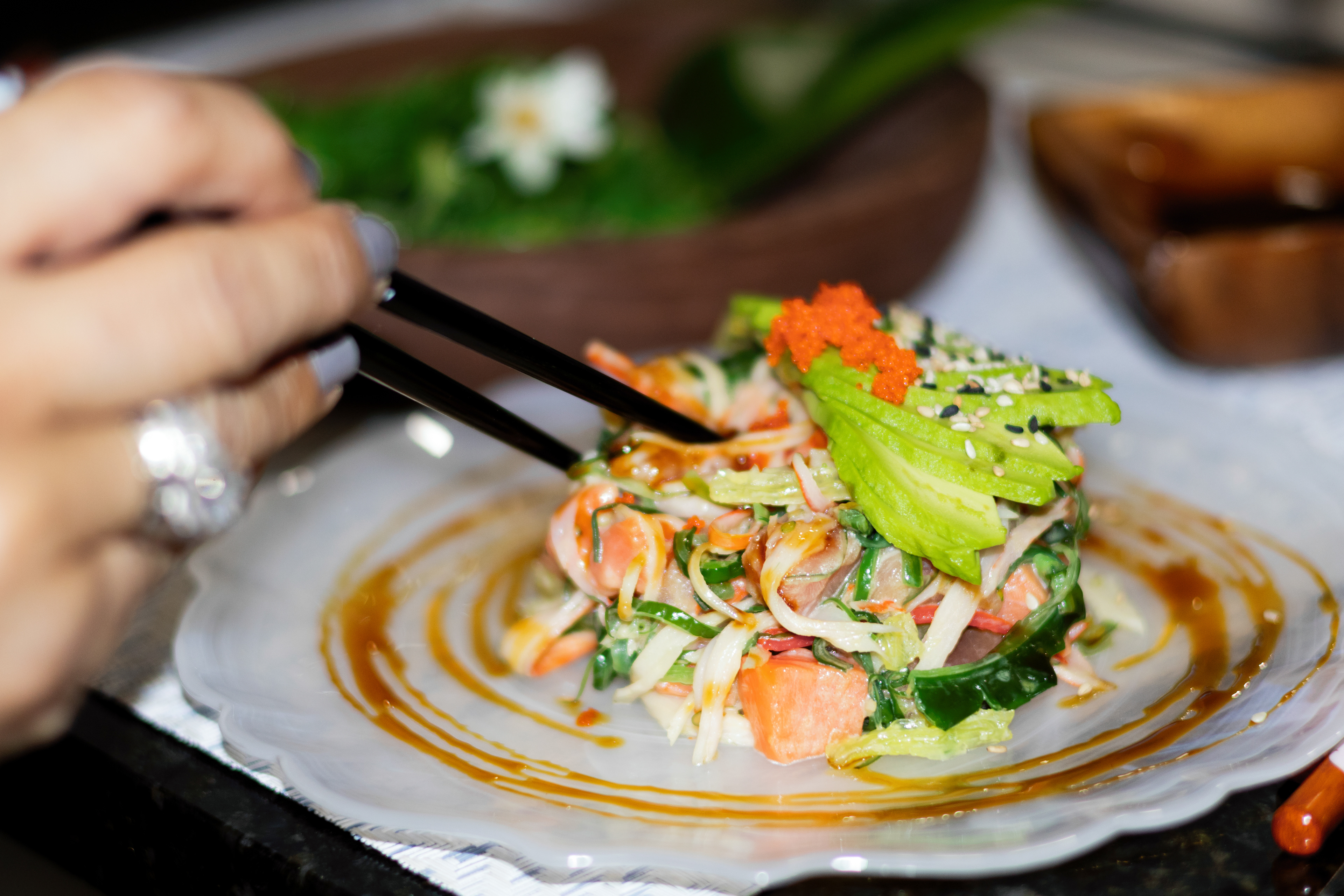
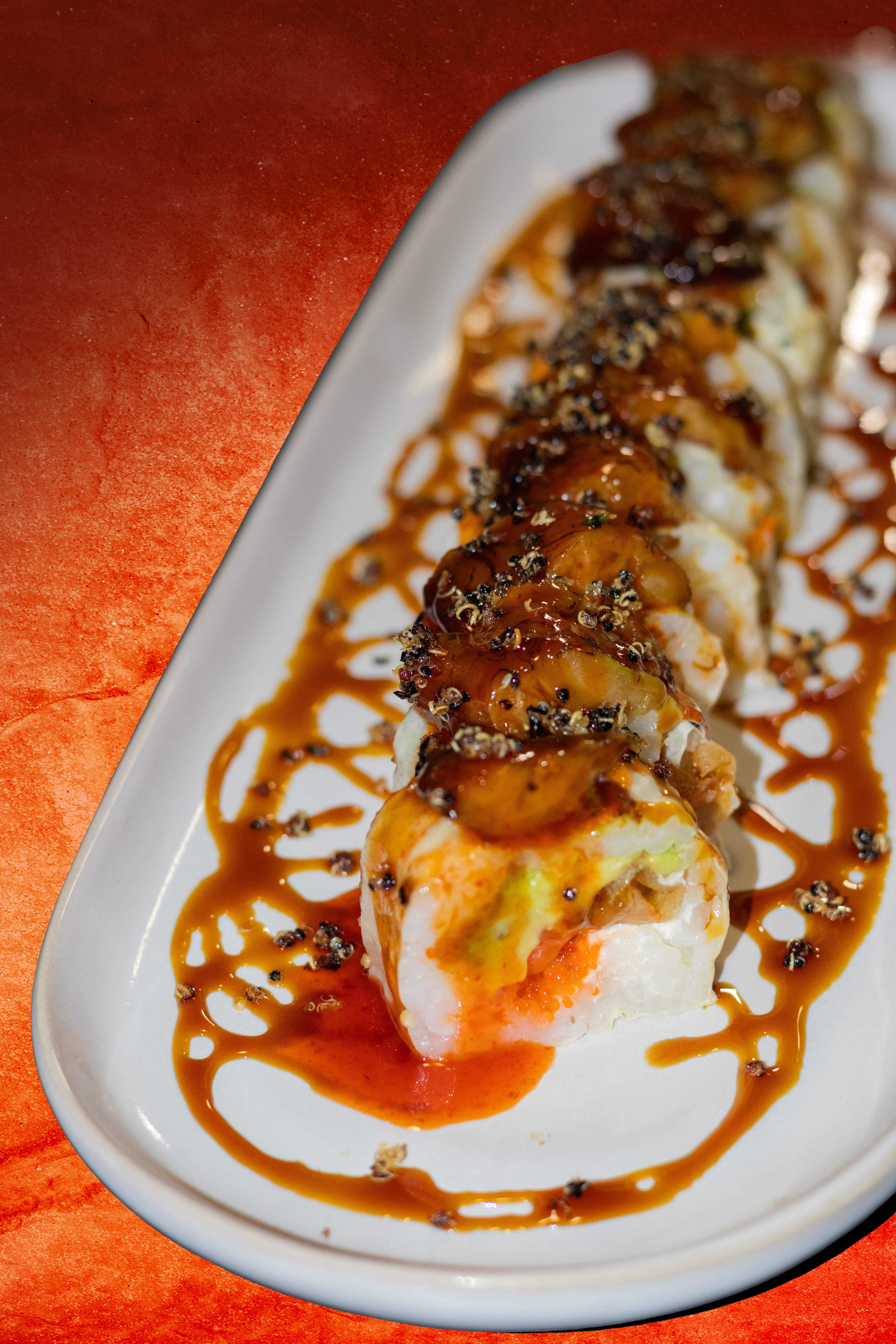
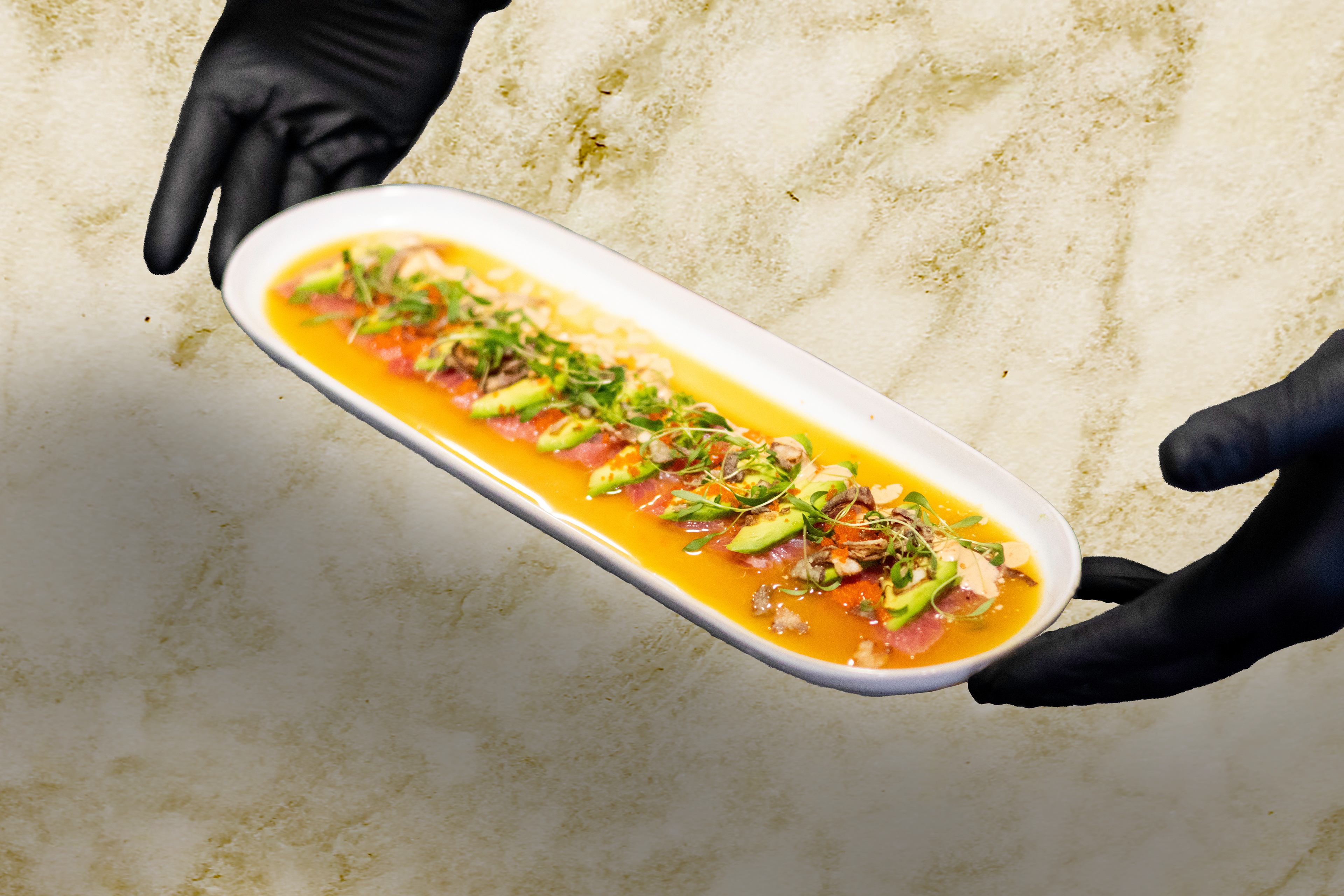
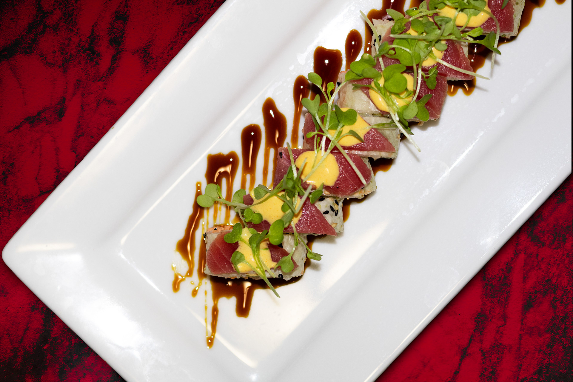
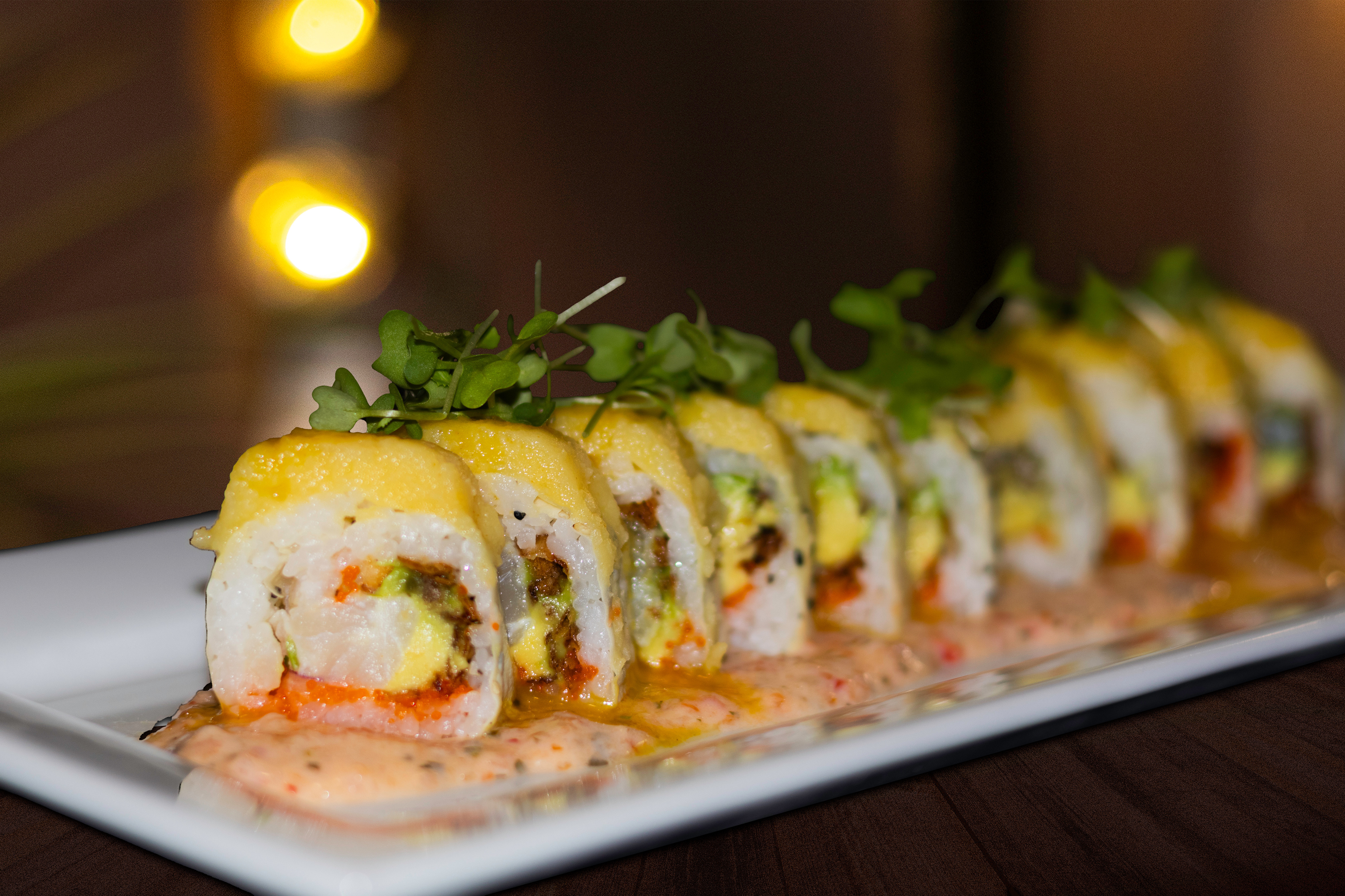
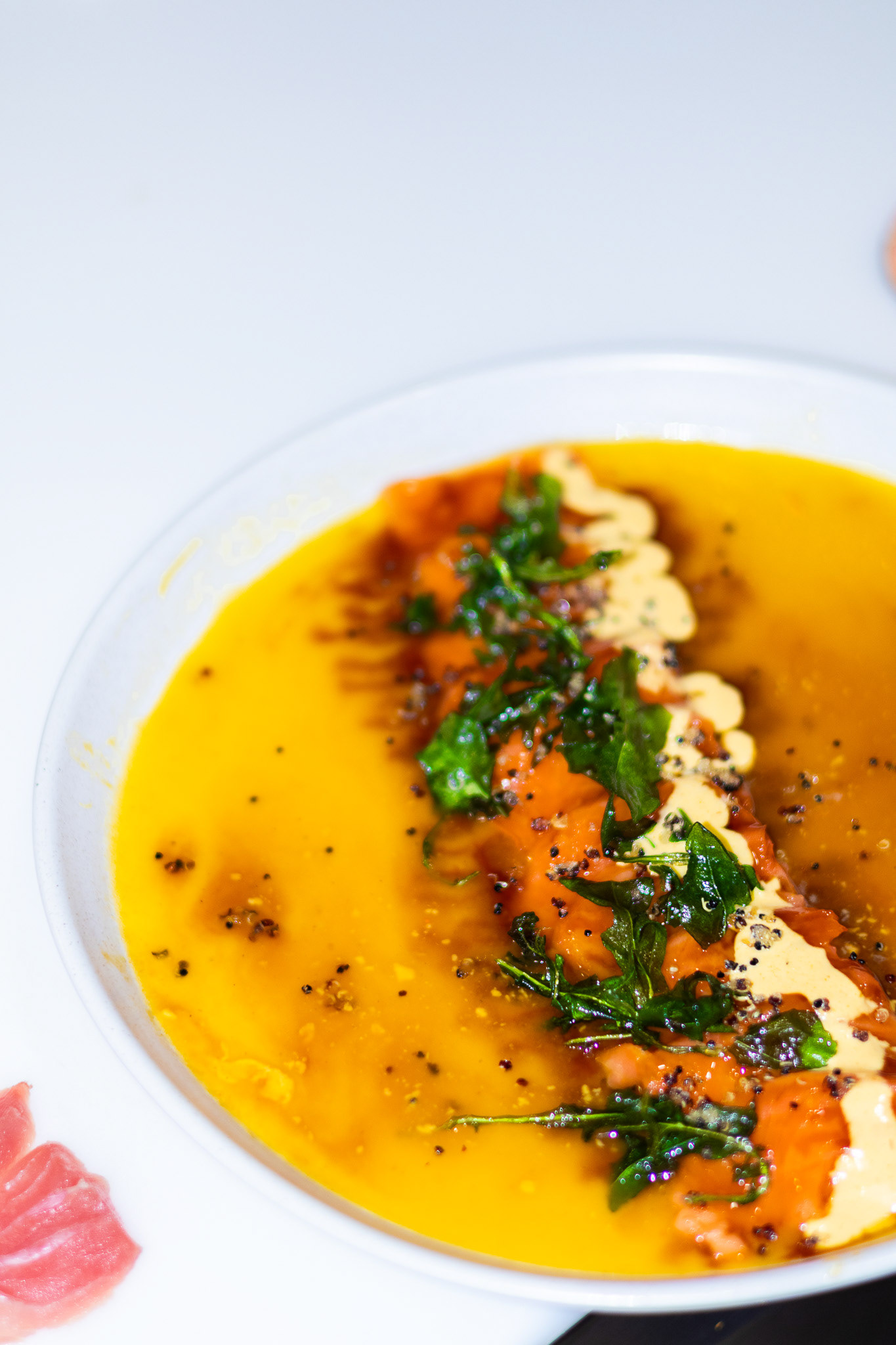
I shot and edited all food photography, using flash and sharp shadows for an urban, energetic style. Each image was retouched for lighting, contrast, and background color to complement the warm brand palette and highlight dish textures.
Highlights
• Action shots (chopsticks lifting sushi/tiraditos) for a playful, real-life feel.
• Clean dish close-ups with bold contrasts.
• Consistent edits for brand harmony.
Menu Design
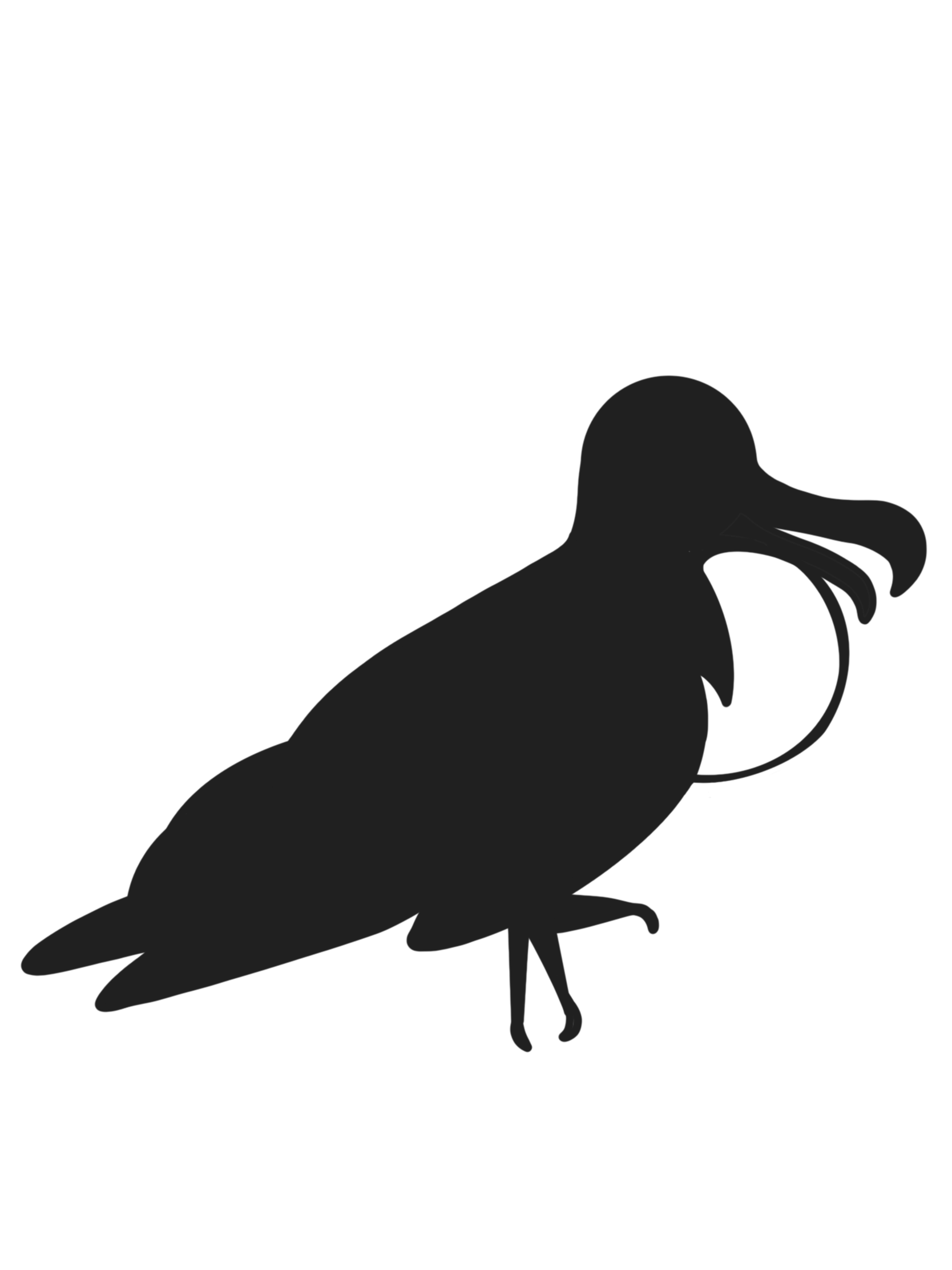
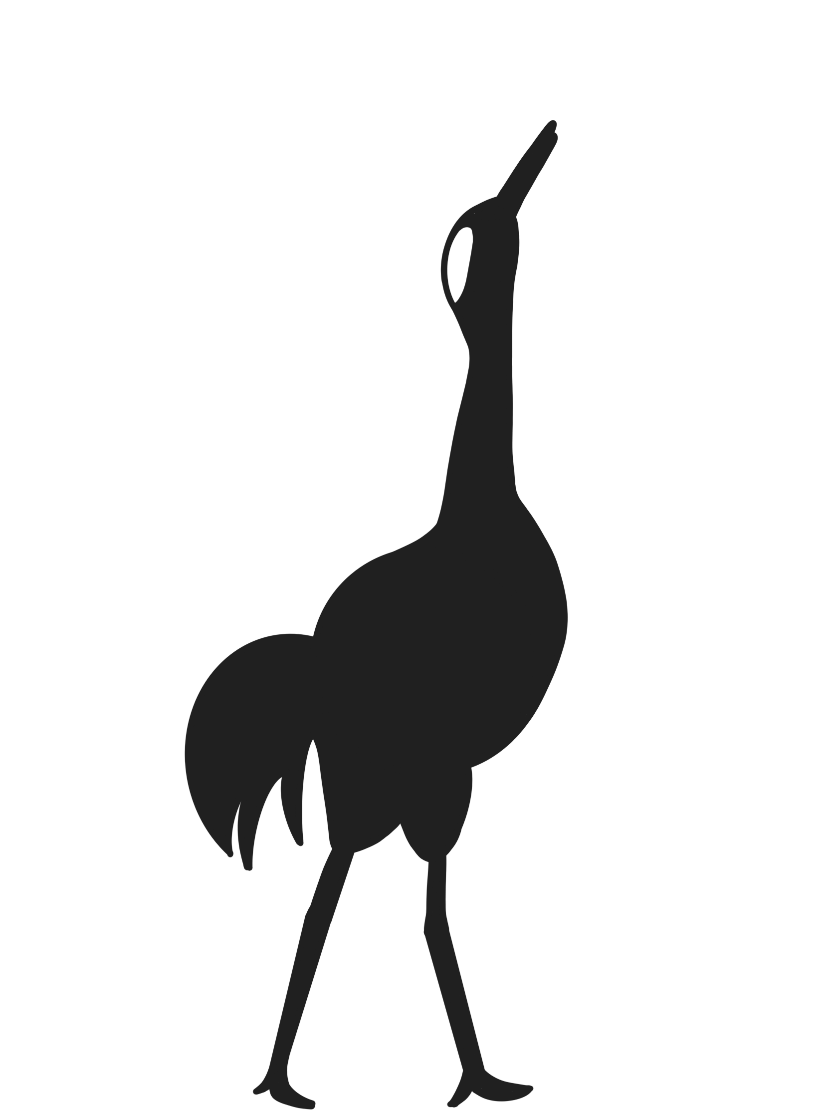
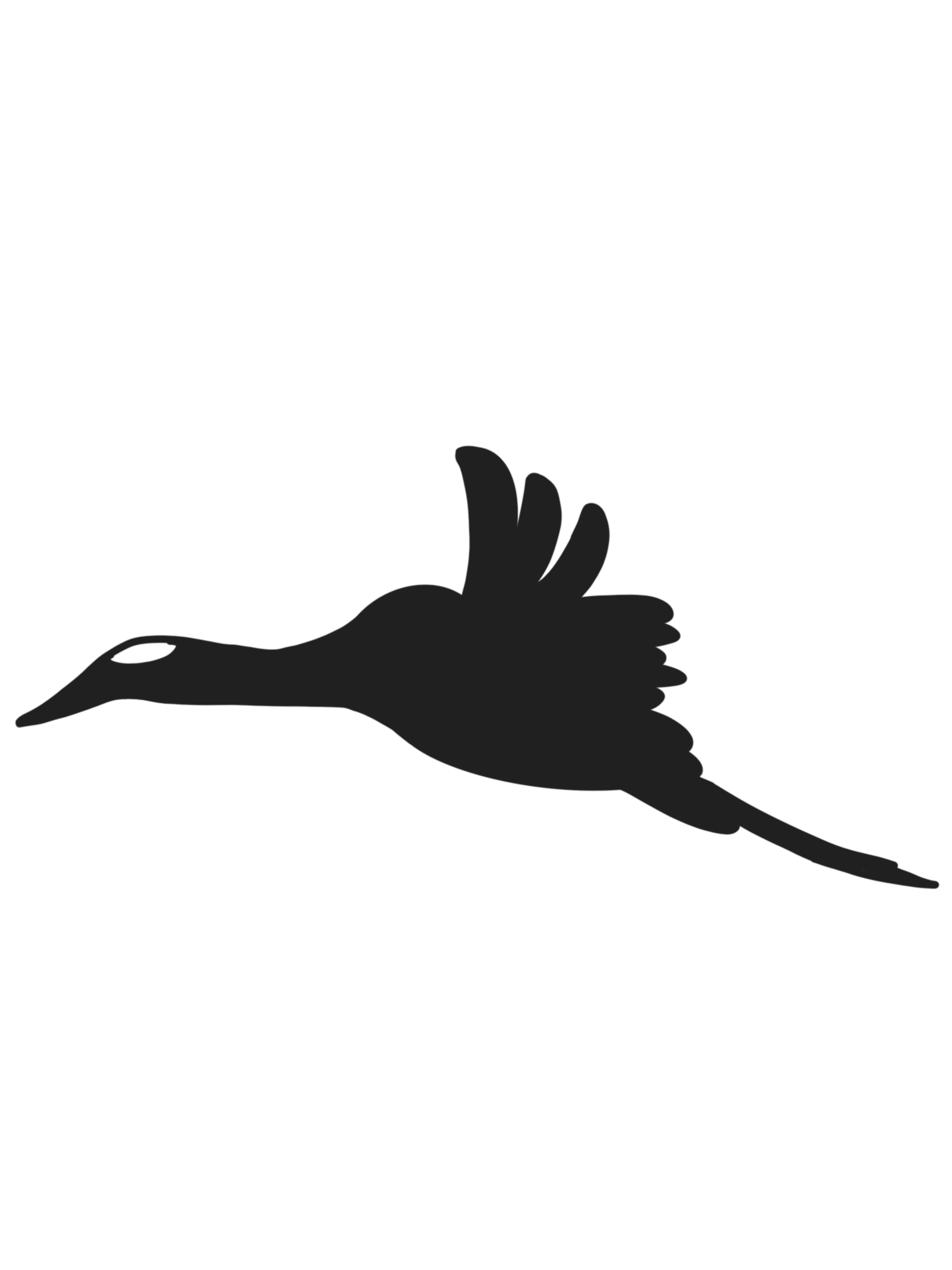
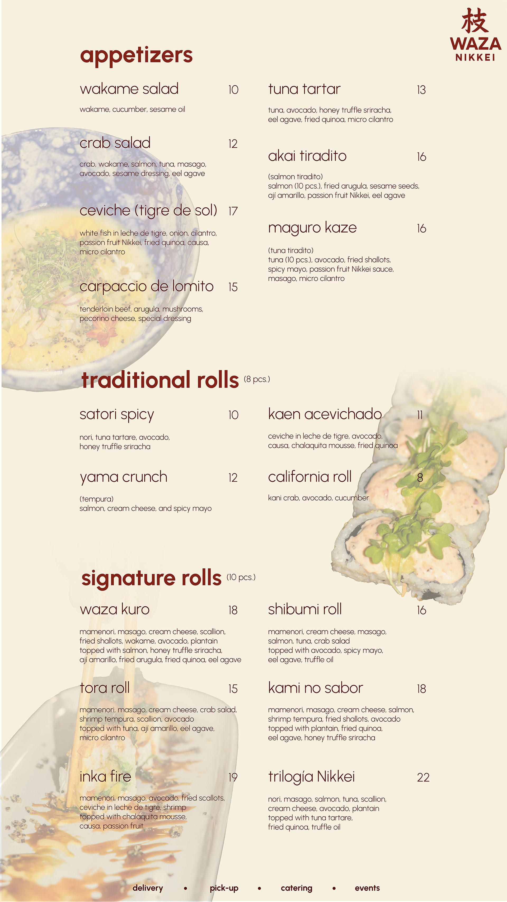
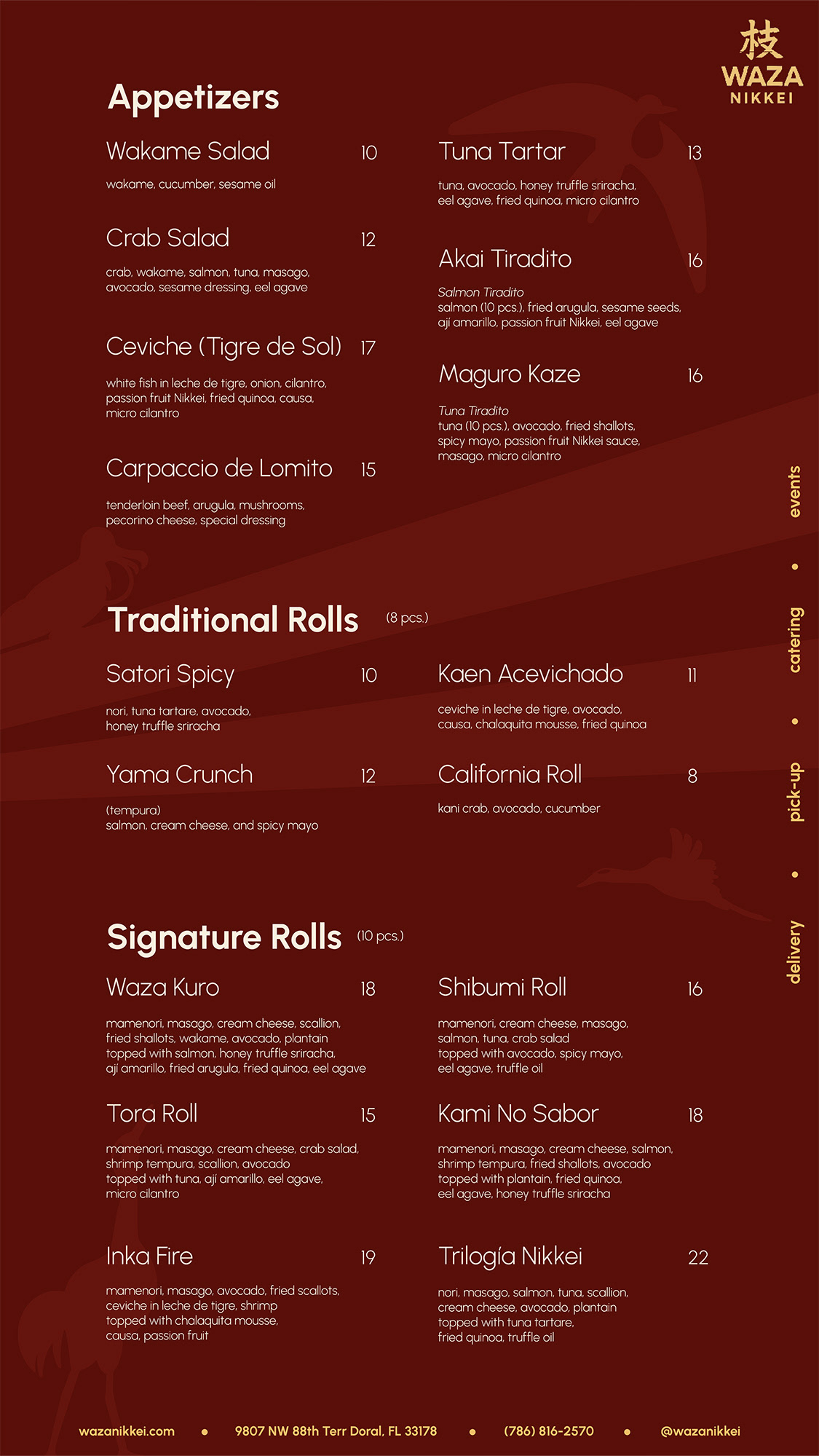
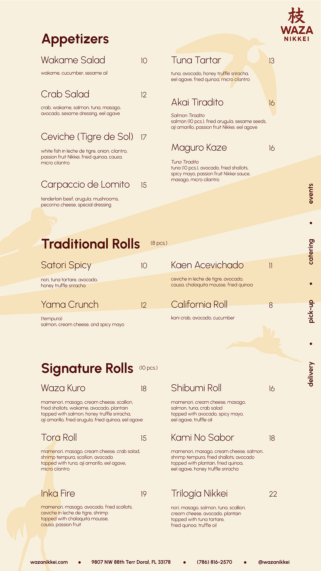
I designed the restaurant’s main menu using Urbanist typeface for clarity and left-aligned hierarchy for modern appeal. Bold typography guided attention to headlines, while subtle illustrations of signature dishes (Ceviche, Kaen Acevichado, Waza Kuro) added character.
Sketches
Final Design
Website Design (Shopify)
Using Shopify, I customized a template to integrate the brand identity and my original visuals. Bold typography and branded banners ensured the site felt lively, cohesive, and easy to navigate.
Click on images to visit website
2025
